
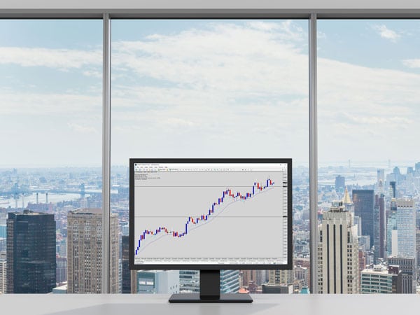
 Do you want to be able to open up any price chart, and forecast near term price action with confidence on your own?
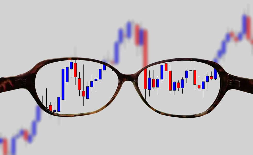
Every trader aspires to be an awesome technical analyst. It’s one of the core skills needed to be able to trade the Forex market like a boss.
Price Action Trading is the methodology you will eventually fall in love with.
Let’s face it, it’s a very seductive and addictive form of analysis, and when done right – very lucrative!
At it’s core, price action is something trading systems need, and many have been derived from its principles.
Once you master the charts, you can come up with your own flavor of trading system that works for you and be proud of its results.
But first, you need to master the charts, and become your own king of technical analysis.
In this guide, I’ve got some awesome tips that will make the charts just pop out at you, instilling a huge boost in clarity in your analysis next time you open your trading software!
Are you ready? Let’s begin…
perform.
Note:
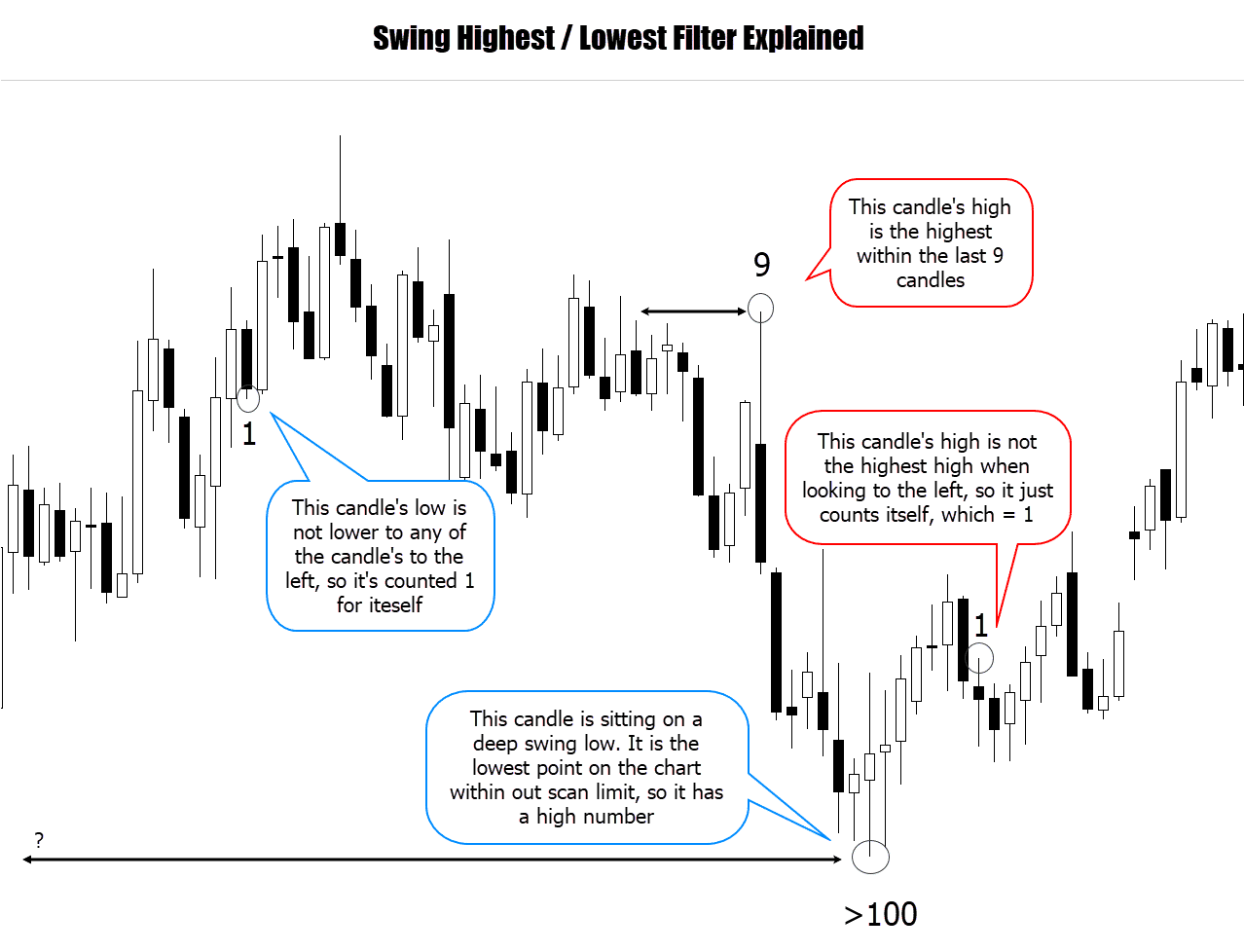
Since this is my first candlestick pattern strategy evaluation, I wanted to focus on something really really simple – the candle body.
1. Get Context – Read The Story Of Price Action
 What’s the number 1 issue with price action noobs?
Easy, trading candlestick patterns in isolation!
This has got to be the trap that every new trader trips over when they first open the door to trade price action, and continue to be stuck with this toxic mindset!
I really can’t stress this enough – a candlestick pattern on it’s own is a very weak signal!
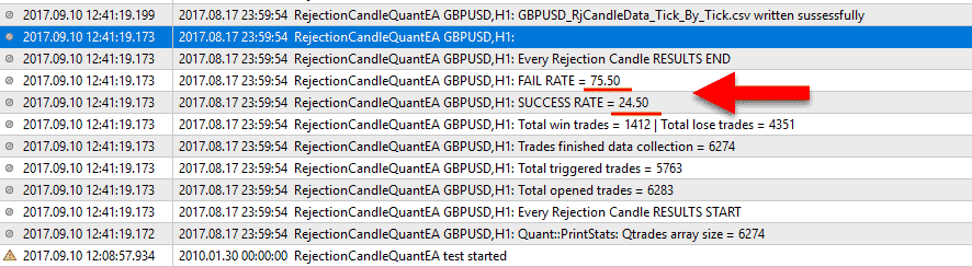
Actually, I have some fun fact data to share from some recent testing.
I wrote a program to evaluate a scenario that would trade every single candlestick reversal, specifically the pin bar / rejection candle.
The program only looks exclusively for the pattern as a trade signal, that’s it! It doesn’t care about the size of the candle, the market conditions, nothing! If the Forex price action pattern appears, it starts recording data.
Can you guess what the success rate was?
Taking ever single pin bar candlestick signal (across various pairs and time frames), averages out have about a 20% expected success rate – which in real life trading terms, is like jumping on the bankruptcy bus.
Candlestick patterns are awesome to use, but they should not be the first, or only factor in your trade decision making process.
This is where I drive home the point to look beyond the candlestick patterns, and get market context BEFORE you make a trade decision.
When analyzing the price action context, some things you need to consider are:
- Current price structure
- What’s happening on the higher time frames
- Forex price action to the left
- Relative location of price to other important technical factors
- Presence of price action reacting with support, resistance, trend line structures etc
If I could illustrate my point here, I would show two charts. The bad way, and the professional way to approach candlestick signals.
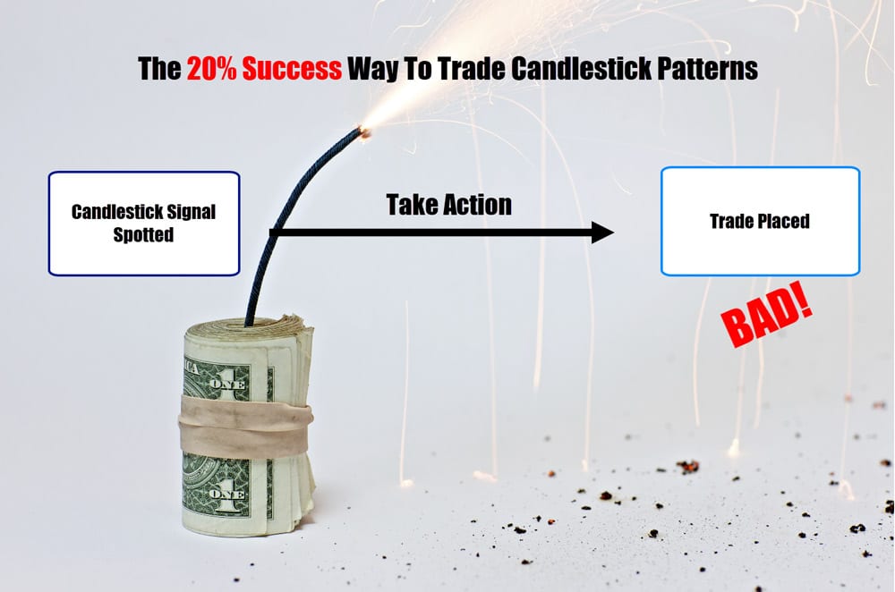
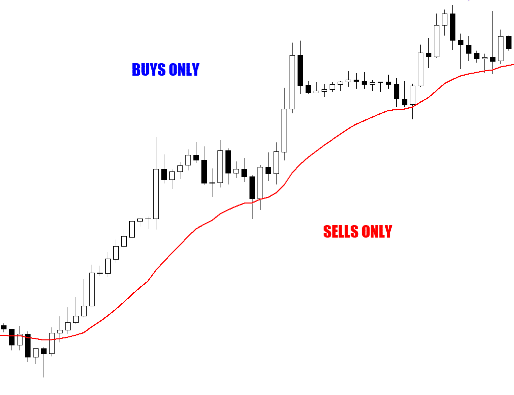
Look at the flow chart above, is this level of decision making you take when putting your money on the line?
Now look at the chart below, this is how I recommend you approach a trade decision that involves a candlestick pattern. Give this a try…
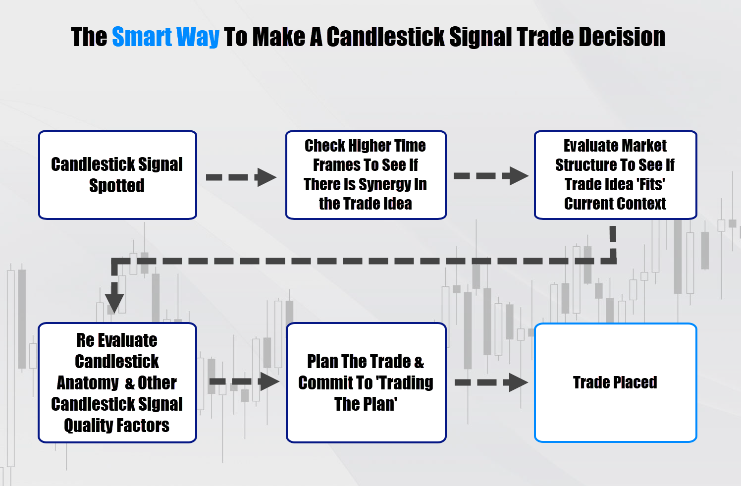
The success rate is much harder to achieve with a quantitative simulation, due to the discretionary (human decision) factors – so I can’t put a % against this, but I will continue with my work here.
If you’re guilty of the first flow chart, try switch to the ‘get context’ flow chart, and watch how quickly you start filtering out bad signals.
Check out this example…
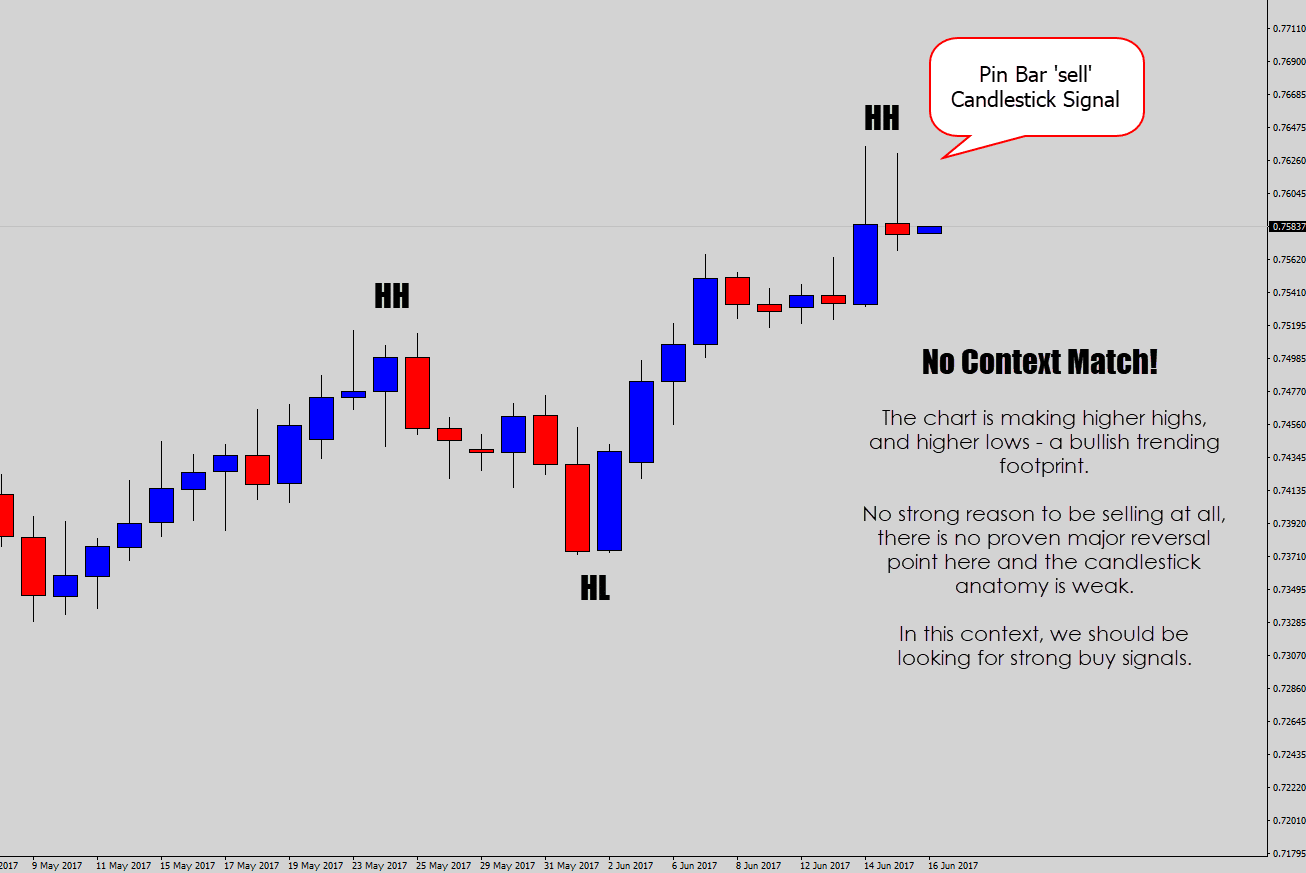
Above: Very hard to build value to a ‘sell trade’ here, based off the pin bar candlestick alone.
If you look beyond the candlestick, you can see the market is very bullish. That’s evident by the higher highs, and higher lows being printed, which is the footprint of a bullish trending market
If you want to sell against that, you need to have really strong technical evidence that a reversal is likely to occur (I’ll cover that later in the tutorial).
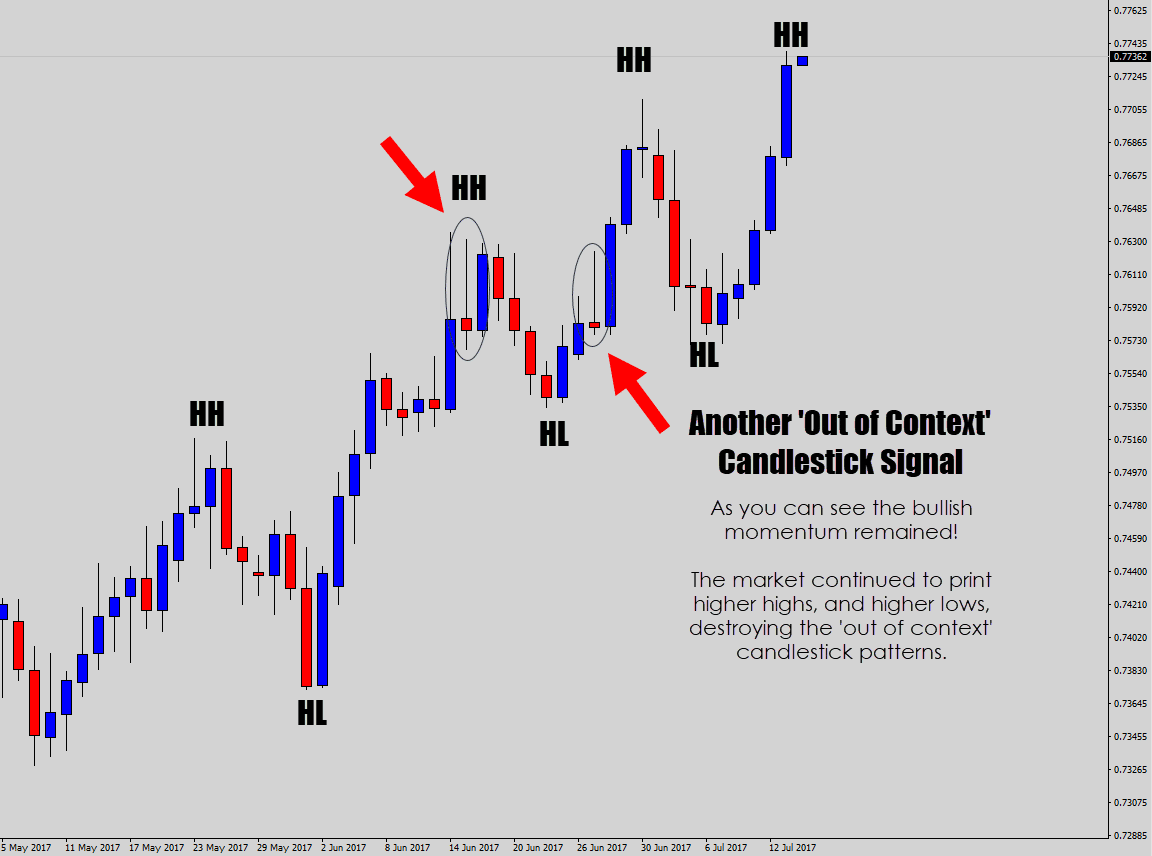
Above: The ‘what happened after’ shot. As expected the bullish moment continued, because that’s what the market structure was screaming after. Market structure analysis through reading price action takes priority over candlestick signals (remember the flow chart above).
Any price action based signal is going to dramatically change in value depending what kind of market environment the trade setup forms in.
Lets take a look at a signal that fits within the market context…
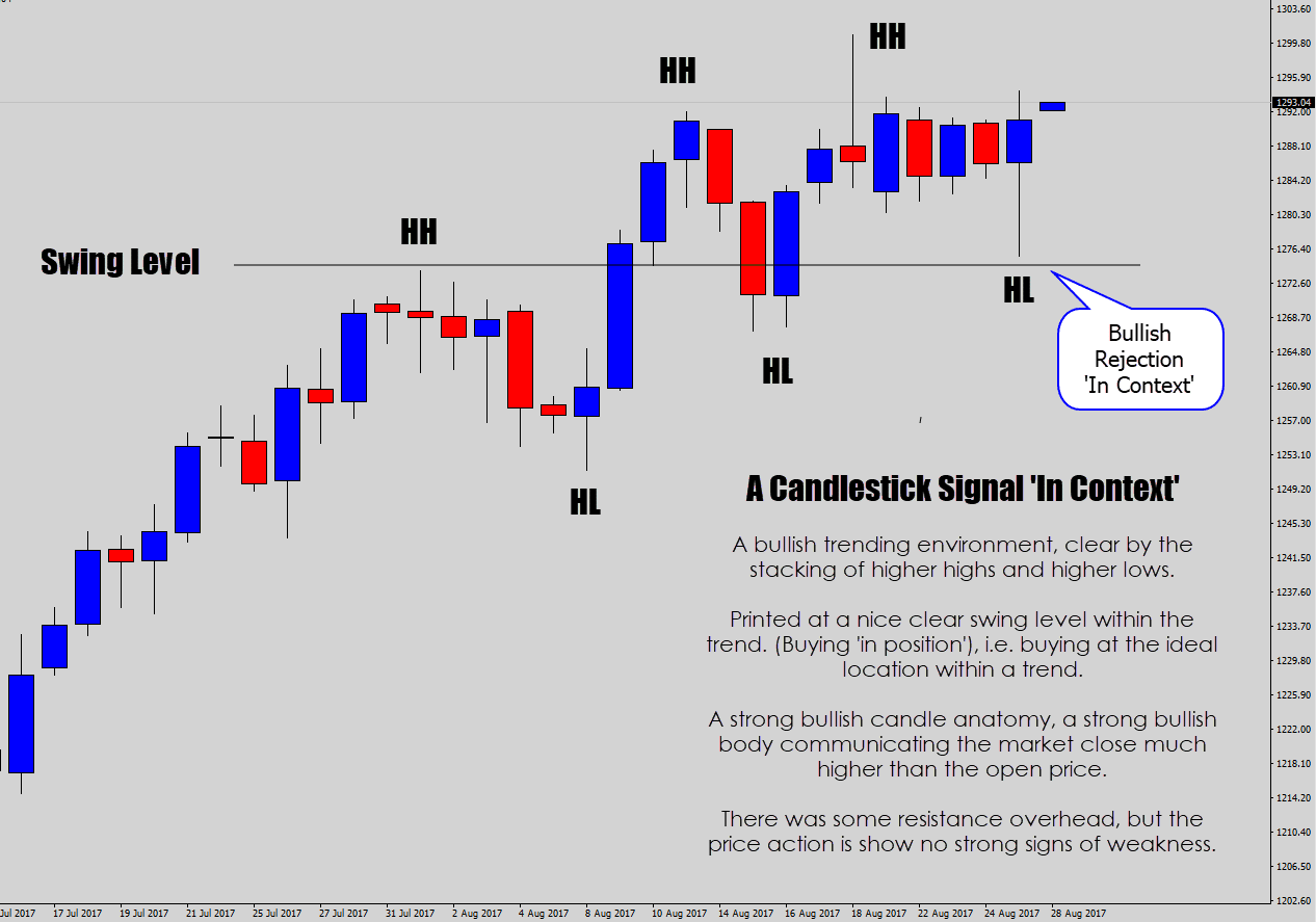
Above: A candlestick signal that fits well within the ‘story’ price action is communicating here.
A similar structure to the previous example. This market is making higher highs, and higher lows – a bullish market, where we should be looking to buy only.A bullish rejection candle formed here, and off a trend swing level. The trade idea is within context and has a lot of technical value.
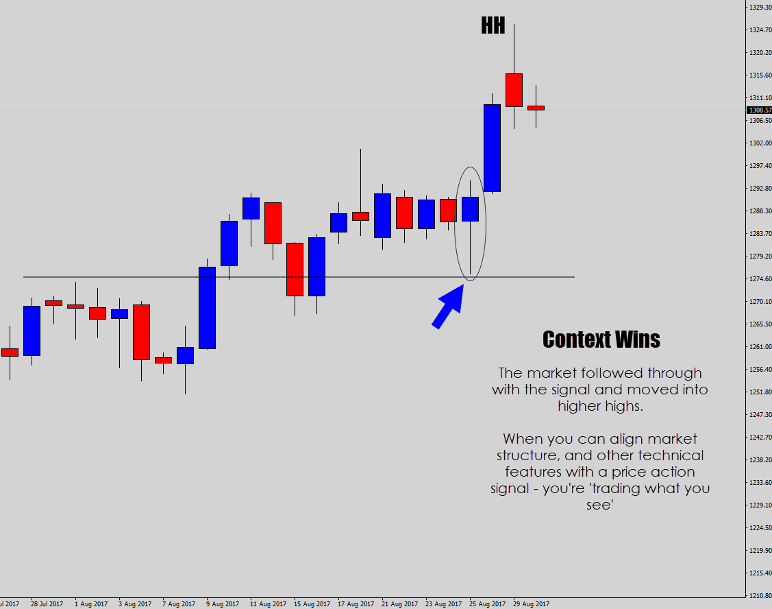
Above: The bullish rejection candlestick signal had good follow through, which is expected, because it was backed by many technical factors – aligning it with the market context.
Checkpoint
Start looking beyond the candlestick patterns. Take a step (or two) back, look at the market structure, and other technical factors like support and resistance (especially weekly S/R) to help build value into a buy or sell trade idea. Then see if the candlestick signal has synergy with your price action analysis.
2. Top Down Analysis is A Critical Step For Price Action Traders
 You might have heard the term ‘top down analysis’ being passed around the Forex communities from time to time. This nicely complements the ‘getting context’ tip above.
Top-down analysis is the idea of aligning what’s going on in the market from a higher time frame perspective (top), and then stacking it with your trading time frame analysis(down) – to create strong synergy with your trade idea.
This is a critical, and an overlooked step when evaluating a trade idea by many traders who are trying to learn price action trading.
To begin, start your analysis from the top time frame – I recommend using the weekly chart for your entry point.
The weekly chart offers a lot of value, big technical details that you might otherwise miss on your trading time frame. I mostly use the top time frame (weekly chart) for gathering information.
I am looking for information such as:
- Critical support and resistance levels: Levels which have proven to act as a major turning point in the market before.
- Dominant technical features: Major trend line structures or price squeezing structures.
- The market structure: Which way are we moving/trending? Where are we within a range? Is this a choppy consolidation period?
- Previous weekly candle anatomy: Provides good insight to where price is likely to try move.
Then we move down to the trading time frame…
Because I am dominantly a swing trader, that’s anything between the “4 hour” to “Daily” charts. Occasionally I will use the 1 hour chart for an aggressive swing trade entry, but only when I can build very strong top down analysis.
When you’re on your primary trading time frame, it is business as usual – looking for details such as:
- Market structures: trending, ranging, etc.
- Turning points: trend lines, swing levels, support/resistance or whatever your trading system dictates is a technical feature.
- A clear trade signal: usually a candlestick pattern, or some kind of price action event.
To illustrate why this is important, lets walk through an example where we disregard top down analysis and focus only on the trading time frame.
This example is a ‘what can happen’ if you ignore the bigger picture, so we will just check in to see what the higher time frame chart is communicating so I can make my point…
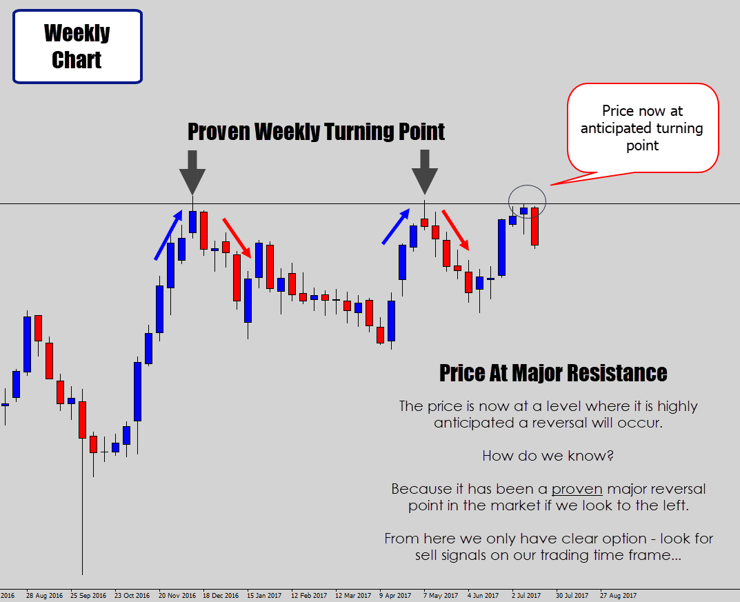
As per usual, I begin on the weekly time frame.
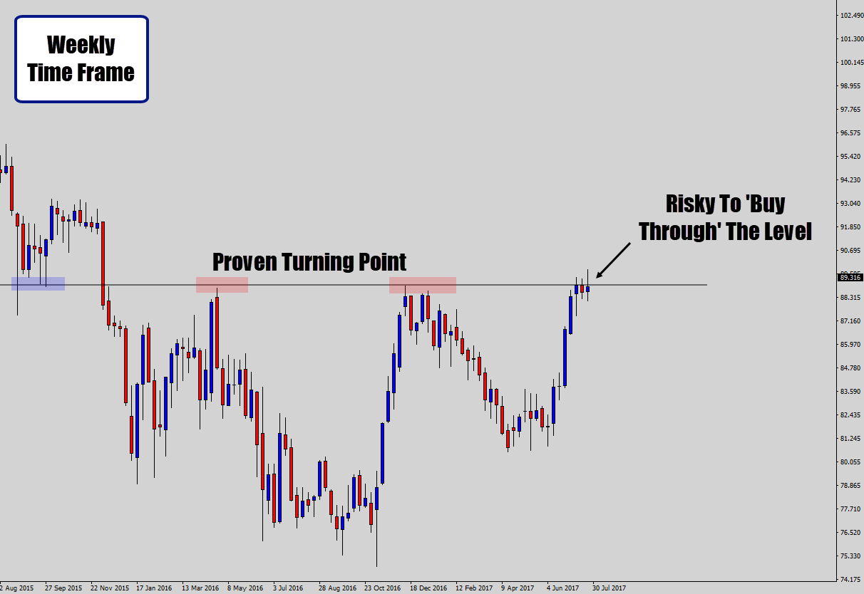
From the weekly time frame we gather the key information I would normally bring down to the trading time frame.
We can see price is testing a major weekly resistance level here. This is something we do not want to attempt to buy through.
It is a risky practice to try trade ‘through’ weekly turning points.
If anything, we could consider looking for sell signals off that level on our trading time frame.
Now we have the information in hand, keep it in mind. We will go to the trading time frame – in this case, the daily chart, and disregard what we’ve learned from the weekly chart.
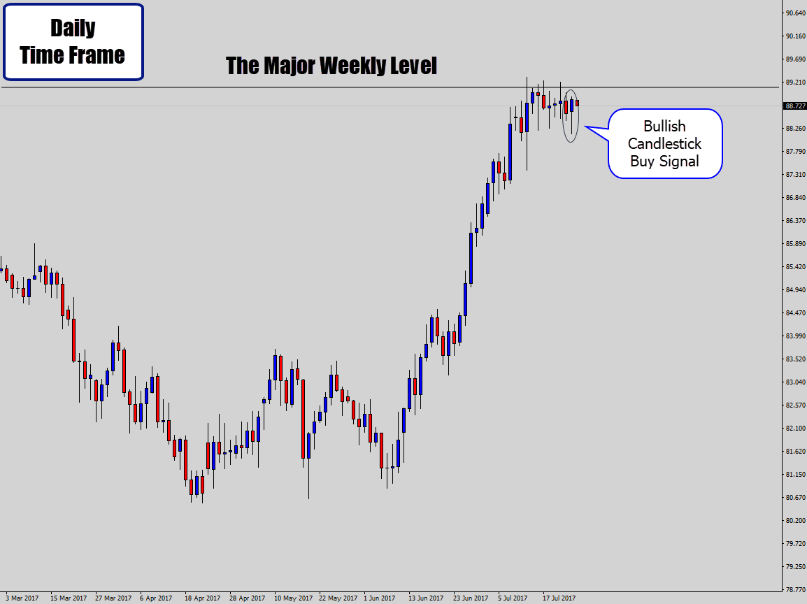
So we see a bullish candlestick signal on the daily chart.
If you were stuck in the mind-set of ‘trading a candlestick signal just because it’s there’, then you might take taken this.
This is what happened next…
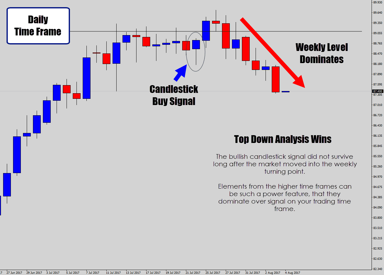
Above: A classic scenario where the higher time frame analysis overpowers the single value of a candlestick trade signal on the trading time frame.
In this case, it is bad practice to try and challenge the market by buying or selling through proven major turning points.
Without the top down analysis element here, we could have easily overlooked the major level, not even knowing the danger was there in the first place.
This is the kind of ‘tunnel vision’ a lot of faster paced, lower time frame traders suffer from.
Top down analysis is extremely important when you’re thinking about trading counter trend. I am speaking from a swing trading point of view, where you’re looking to catch a really big move.
Higher time frame analysis actually becomes paramount in a counter trend trade decision!
Above: Starting our top down analysis, we can see the price is testing a major level.
We look to the left and see this level is a proven turning point, so we can only logically anticipate one thing – a good chance of a reversal occurring.
Next step: look for signals to fit that analysis on the trading time frame.
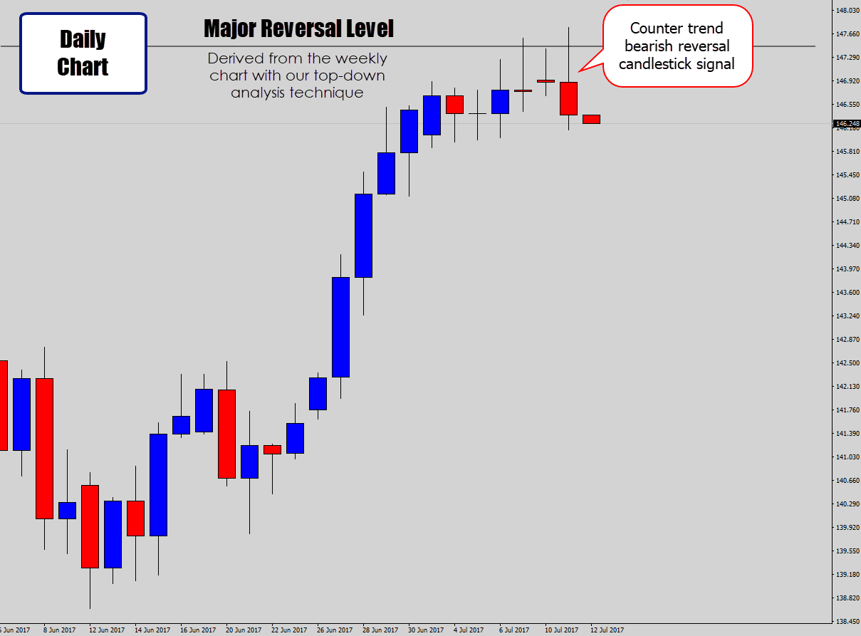
Above: We step down onto our trading time frame and see a bearish candlestick sell signal.
This signal fits the context of the market, and aligns with our higher time frame analysis. An authoritative counter trend signal which builds a very strong case to position against the existing market trend.
If the signal follows through with this bearish pattern, it’s like to be a very extended move, as weekly levels tend to be the starting point for complete trend reversals.
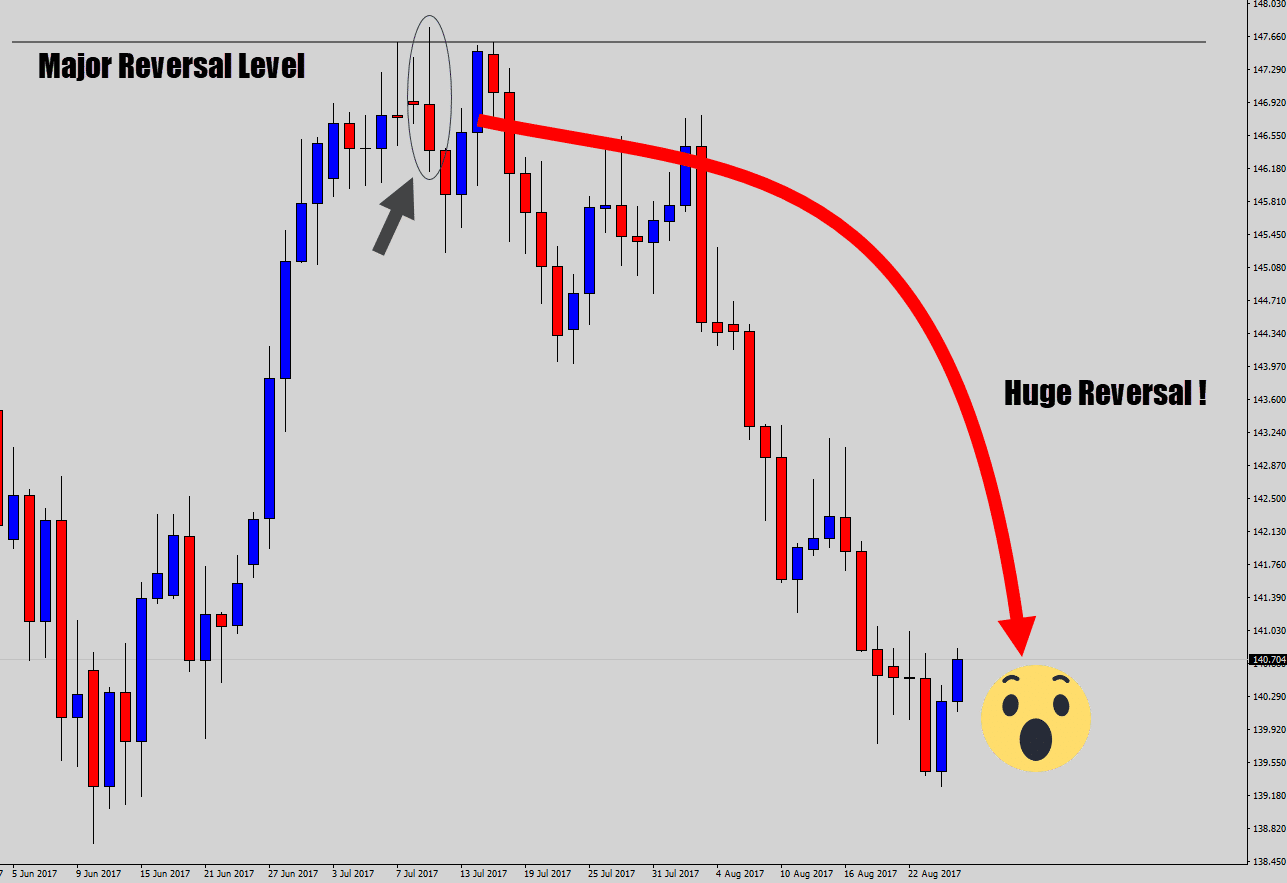
Above: A powerful example of counter trend trading done right.
You’ve heard the sayings over and over: ‘trade with the trend only‘, ‘the trend is your friend‘.
Well, those catch phrases are only true while the trending context is relevant.
You need to use top down analysis to make sure you’re not going to trade into any serious trouble spots, or even better – use the technique to spot lucrative counter trend signals, like the one shown above.
A lot of traders are very reluctant to move into lower time frames, due to a lot of misconceptions about trading on charts like the daily and weekly.
Let me extinguish all your fires right here: Busting myths about trading Forex price action on the daily charts.
Checkpoint
Top down analysis is the discipline of aligning technical analysis from a higher time frame, with your trading time frame. The weekly chart works best for swing trading top down analysis. It will give you a clear picture of what you should be doing in the market, help you build value into your trading signals, and help you spot the best counter trend opportunities.
3. Focus on Charts With Clear Price Action to the Left
 One of the quickest ‘spot checks’ you can do on your chart is have a look to the left.
What do you see? Clear trending price action, or a highly congested traffic jam?
When the market seizes up, and the flow of price action stops – we can get these horrible, hostile, churned up periods of consolidation that create ‘minefield’ like signals.
Candlestick signals, and other trades will often form within these conditions, and may be tempting to trade – but are just too unreliable in an unstable market.
There are times you would have had an experience where a trade ‘dragged you through the mud’, because you took the position in choppy market conditions.
A simple check to the left rule can be a good reminder to move on to the next chart, or wait for the next position.
Sometimes no position is a good position – especially when you’re trade is drowning in draw down.
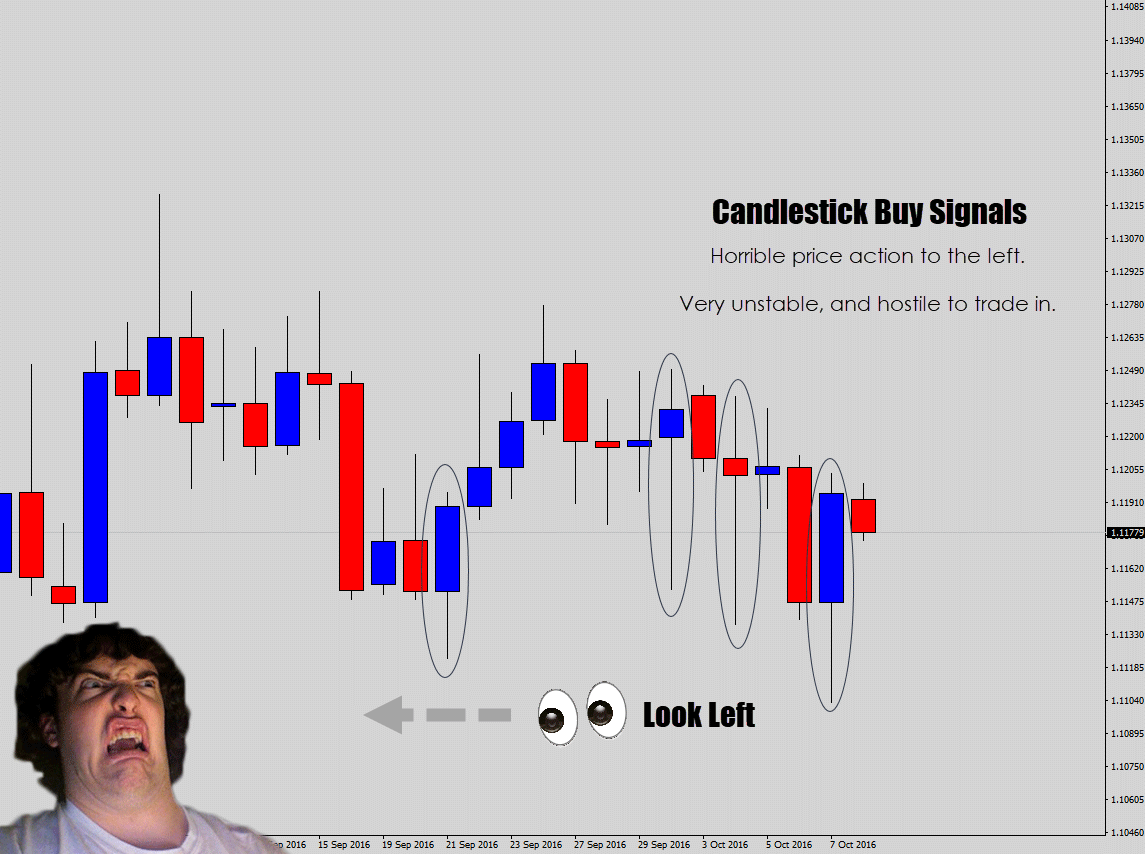
Above: A series of bullish candlestick buy signals form in rough conditions.
We take one quick look to the left, and we see the market very cluttered and congested – just like a peak hour traffic jam.
This immediately tags the signals as very risky. The unstable price action, and no clear market structure makes these types of charts very difficult to make money with.
3 out of 4 of the signals in the example above have had their low’s broken – which means they would have highly likely been stopped out.
Trades will often float between profit and draw down for days, and give you unwanted anxiety.
I just recently experienced this myself. My trade got caught in congestion for weeks, and the swap rate (interest rate) charges started to build up quite a bit.
Lets take a look at a cleaner example.
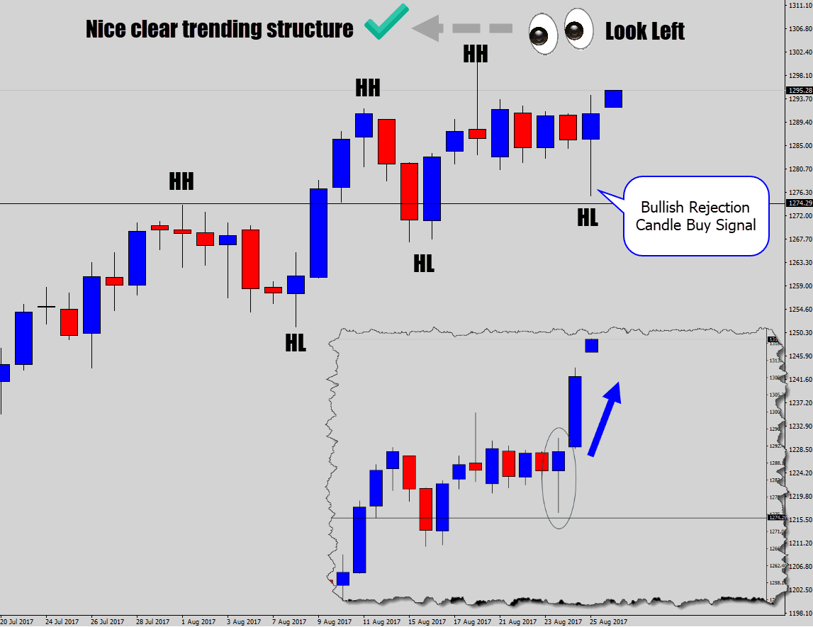
Above: Looking to the left of a bullish price action signal, we see a nice clear trending structure.
The higher highs and higher lows give a nice clear picture to the left, which builds value into the bullish trade idea.
Remember this line:
Muddy waters are best cleared when left alone.
Simply meaning, if you see bad conditions – leave the chart alone and come back when things have cleared up.
If you want to dive deeper into this topic, check out my tutorial: Learn how to trade price action in Forex without using indicators.
Checkpoint
A simple and effective way to ‘spot check’ market conditions is to look to left. If you see a readable price structure, like a trend or range – you’re good to go. However, if you see congested, difficult to understand price action – it’s best to leave that market alone until it becomes organized again.
4. Time Your Breakout Trading Decisions Carefully
 One element to a trading decision, is the timing.
I really don’t think many traders consider this, and just pull the trigger ‘in the moment’.
Depending on what time you evaluate, or make a decision to execute on a trade order – can be a ‘make or break’ factor if the trade succeeds or not.
There are many time-based nuances in trading price action, however in this segment, I am mostly focusing on breakout decisions.
Here is my industry secret…
Breakouts that occur in the Asia session are deceptive, very risky, and continue to have a high failure rate!
I speak from my swing trading experience, but this phenomenon would definitely seep into other trading strategies also.
What usually happens is this:
- A breakout event occurs in the Asia session
- When London opens, the breakout event has failed – then market then explodes in the opposite direction
The fix is simple. Wait until London opens before you make any breakout decisions!
If we know it’s prone to failure, then we can actually use this fakeout as a signal itself. In my opinion, this one should be left to experienced traders – but here is some food for though.
I call this kind of price event the Asia session breakout trap.
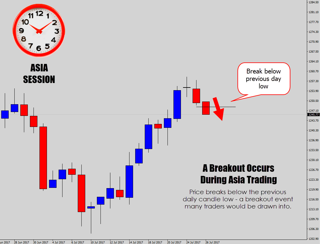
Above: A price action breakout event occurs – the current daily candle breaks below the previous day candle.
In many cases, this could be a trigger for a breakout structured trade. But look what happens when we allow it to be triggered during the Asia session…
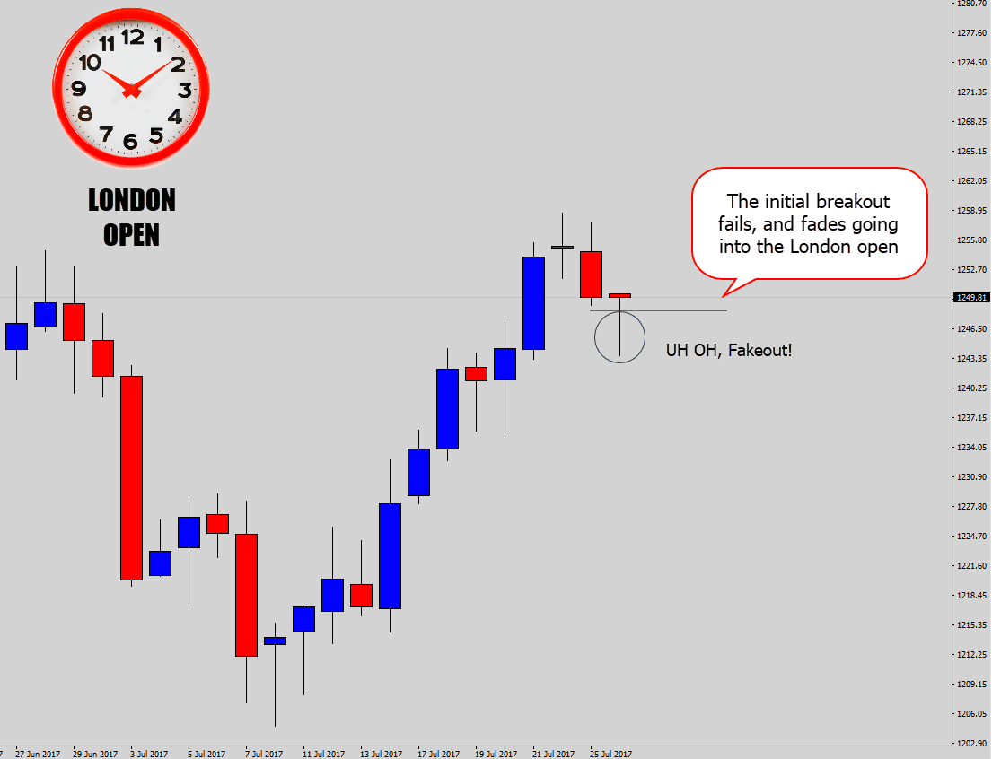
Above: The key moment for this concept. Asia session is coming to an end, and London is about to open. The Asia breakout has faded, and is building strength going into the money sessions!
This is the point of failure. This is the reason right here why I avoid the Asia breakout triggers.
If you frequently check your charts at the London open, you will see this price action event unfold many times. The London open is one of the best times to do your technical analysis, and to make your breakout trade decisions.
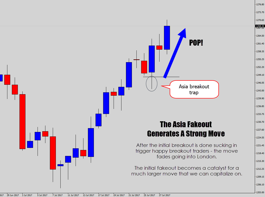
Above: The initial bearish breakout is completely wiped out, and the market actually rallied in the opposite direction for days later.
That’s why we can exploit the fakeout event, and use it as a trade signal.
My theory to why this method is so powerful…
With stops being triggered, there is now less resistance for the market to move in the opposite direction due to an influx of closing trades.
This produces a very powerful ‘aftershock effect’, where price can move great distances on the chart during that session, and beyond.
The event creates an excellent opportunity for us to catch a nice explosive trade – it’s one of my favorite breakout strategies.
If you want you can trade the Asia fakeout directly, or utilize an extension of this setup – which I call the breakout trap and reverse Forex setup.
The breakout trap and reverse system is built off more confirmation:
- First we wait for a an Asia fakeout to occur, especially around key technical areas on the chart
- We can enter on the ‘aftershock move’ using breakout orders (buy & sell stop orders), at the opposite end of the previous candle’s range.
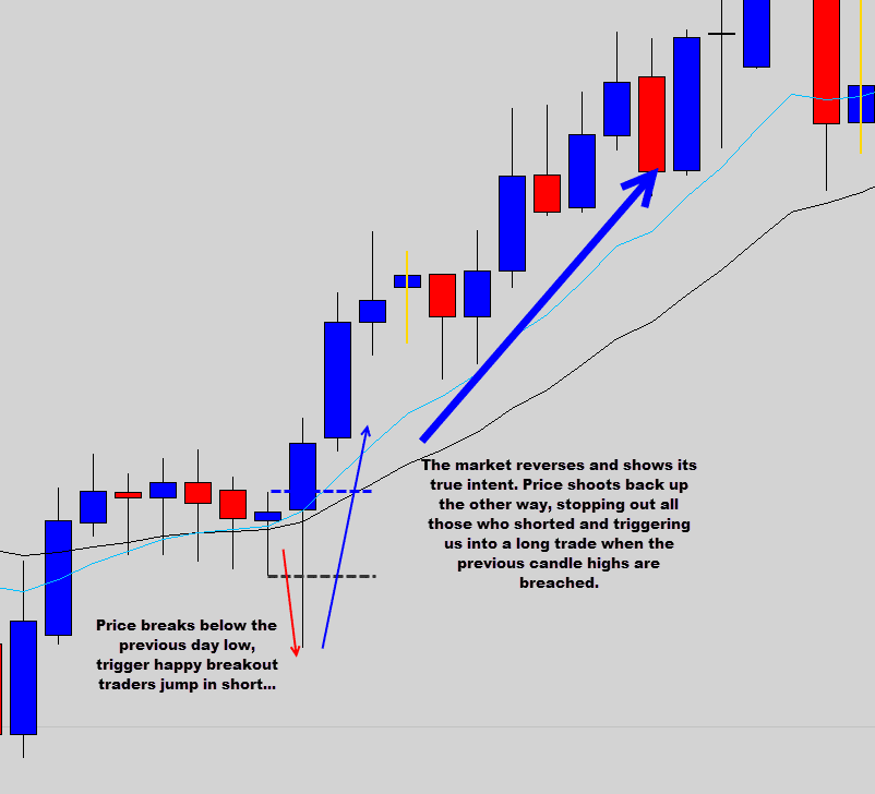
Breakout trap and reverse moves can be violently explosive and give you very high return on investment. But you will need to hold onto them to milk them for what they are worth.
Next time you see an Asia breakout occur, watch the price action at the London open to see what happens.
- Is the breakout showing sustainability, and continuing to produce a nice powerful move going into London as well?
- Or, does it collapse and cause price to charge in the opposite direction?
Checkpoint
A lot of breakouts look like fantastic trading opportunities ‘in the moment’, but [highlight]if your timing is off – you could be entering a dangerous unfulfilled move[/highlight]. These Asia breakouts collapse and trigger an ‘aftershock’ effect that fuels intense movement in the opposite direction when the money sessions open. We can capitalize on these powerful reversal moves.
Want To Learn More Secrets?
I hope today’s Forex price action tips was a good knowledge injection for you. You should be able to go to the chart now and apply these concepts immediately.
If you really enjoyed the strategies and concepts shown in the article today and are hungry for more – then you are invited to check out all the other price action articles, lessons, and video trade tutorials on my site. I am sure you will find them just as insightful.
I recommend my big price action strategy guide.
Going beyond that, I do have a price action war room that I offer for serious traders only. Without giving a sales pitch, it consists of:
- A very comprehensive Forex price action course
- My ‘Chart of the day‘ and weekend video market walk through
- My custom built MT4 software
- Price Action Battle Station (A candlestick pattern, and breakout detector + a lot more)
- Custom Chart Builder (Build custom time frames, custom candle open/close times, Renko & Heiken Ashi charts)
- Trade Management Panel (Quickly open trades, auto calculates risk, OCO orders, straddle trades, trailing stops + a lot more)
- A 24 hour Private Chat Room for the War Room group (share charts, ask questions etc)
If you would like to learn more about that – check out my War Room Information Page.
Again I hope you walk away from the lesson today, feeling empowered to master Forex price action. If so, please don’t forget to leave a comment below and let me know your thoughts.
Best of luck on the charts!
 In today’s article, I am going to kick off my new series on Forex strategy analysis.
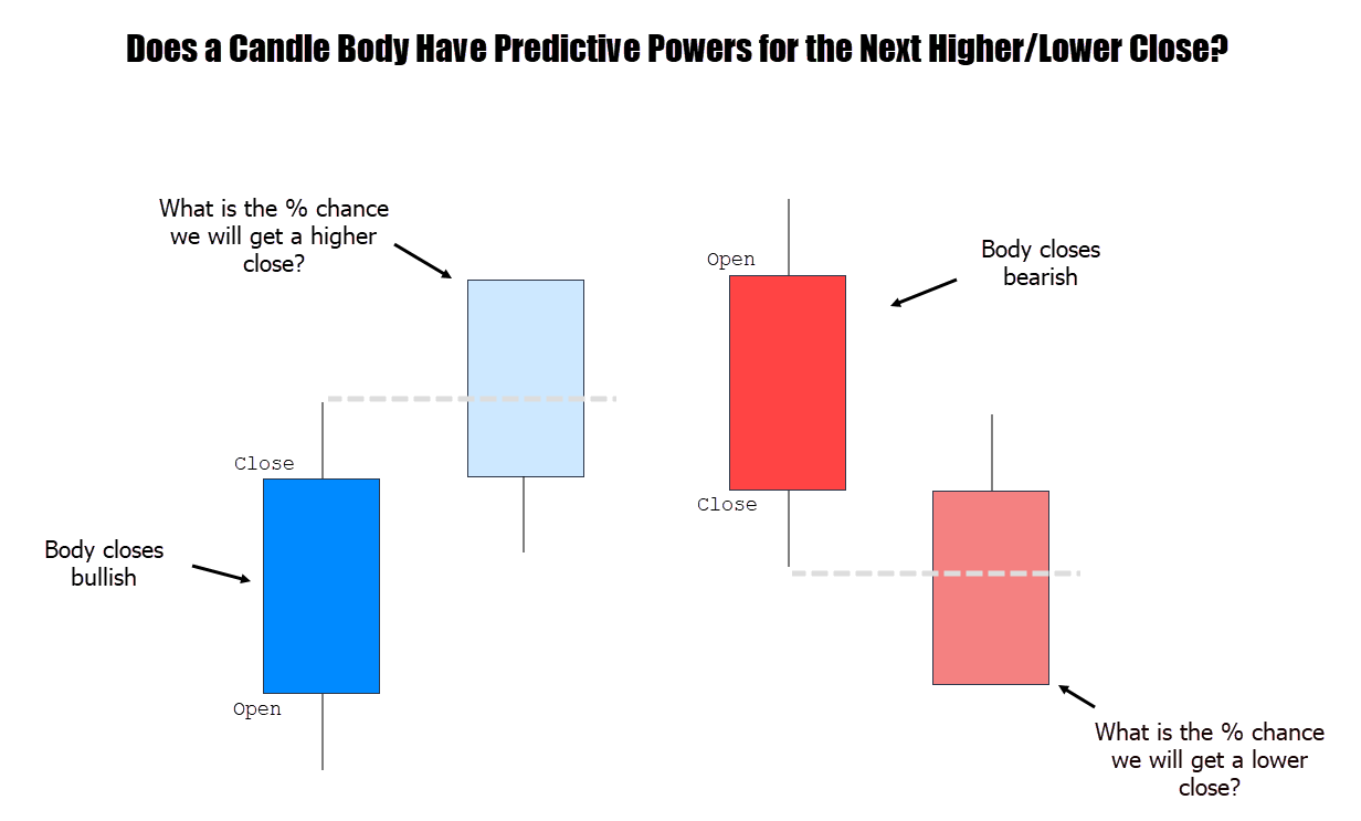
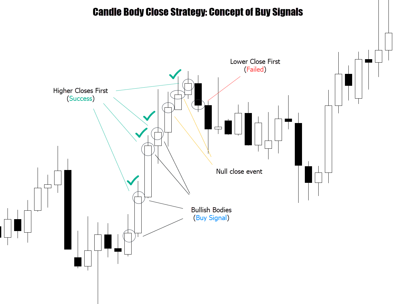
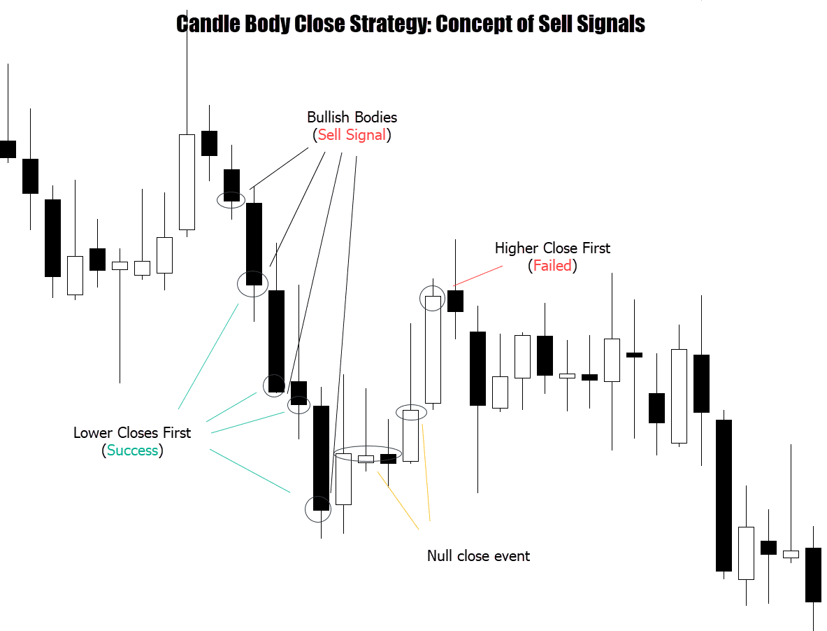
 One of the obvious, first measurements we can observe is how the candle body’s size effects the success / failure of the signal.
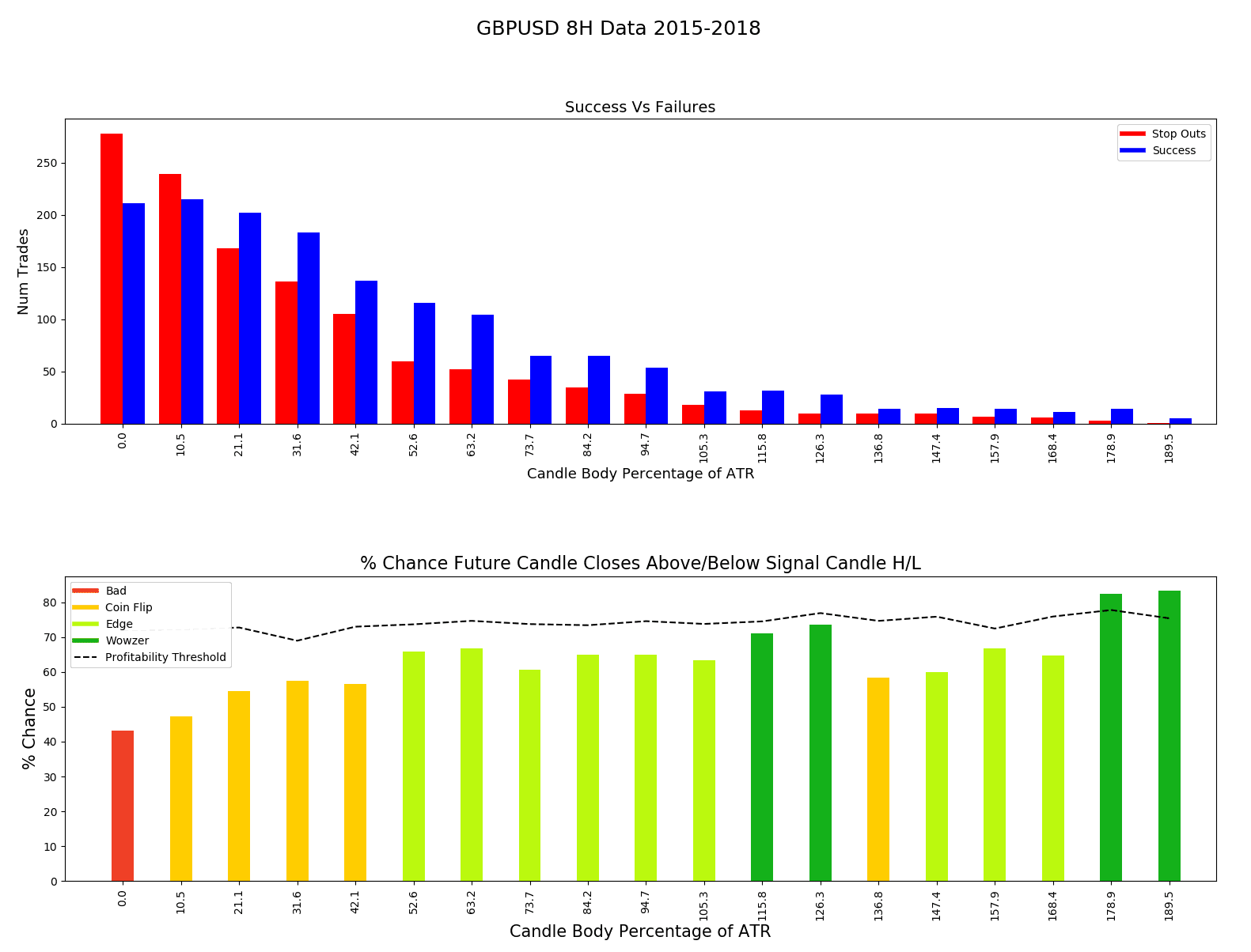
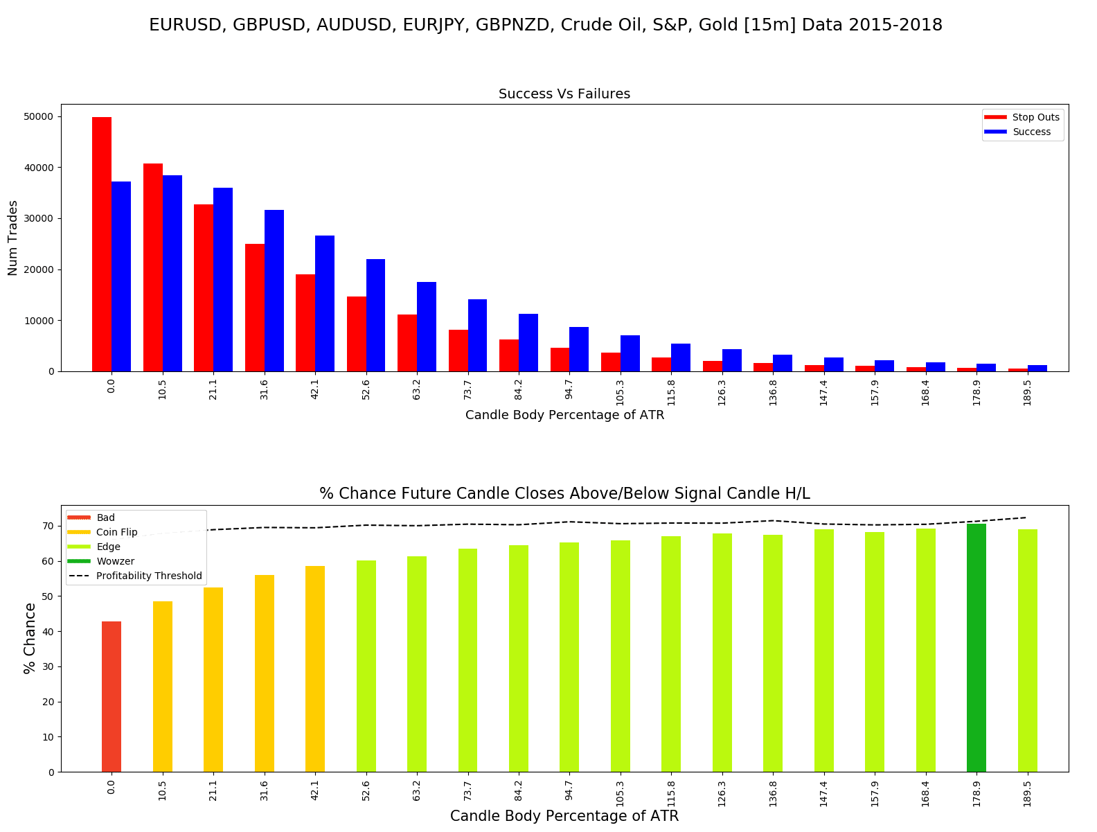
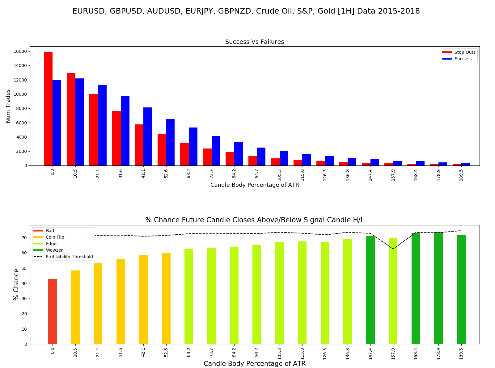
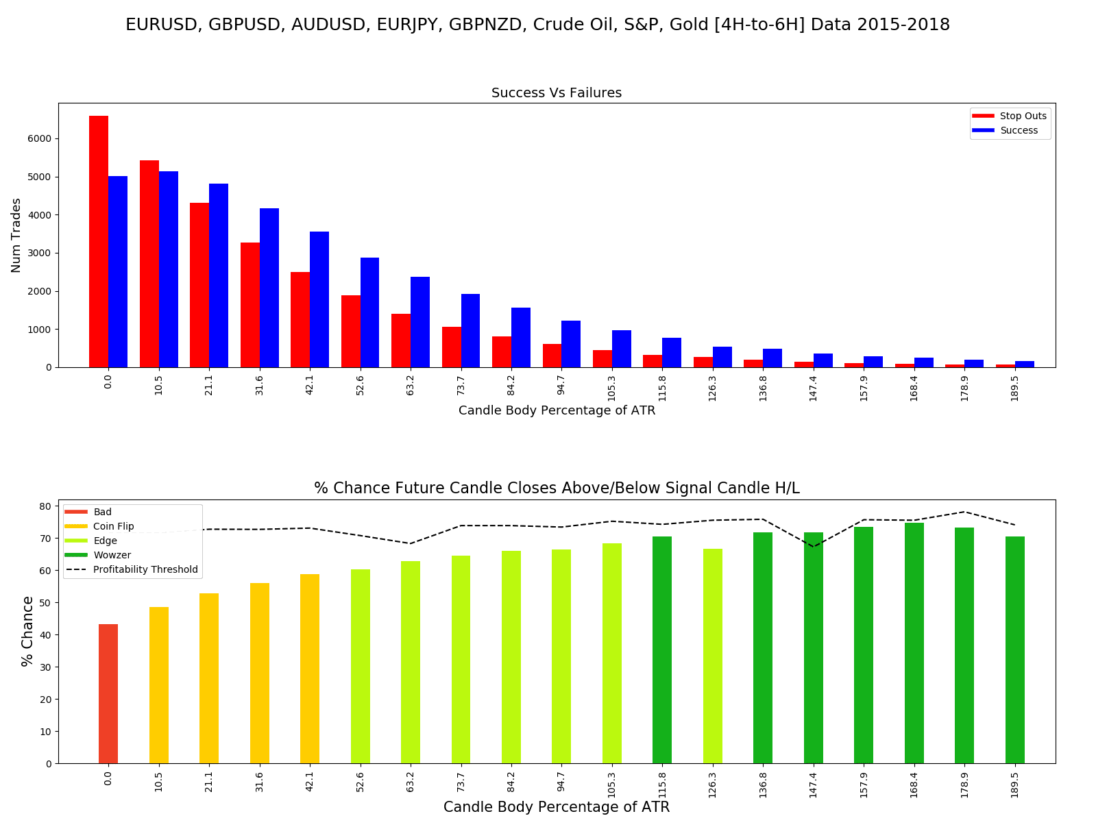
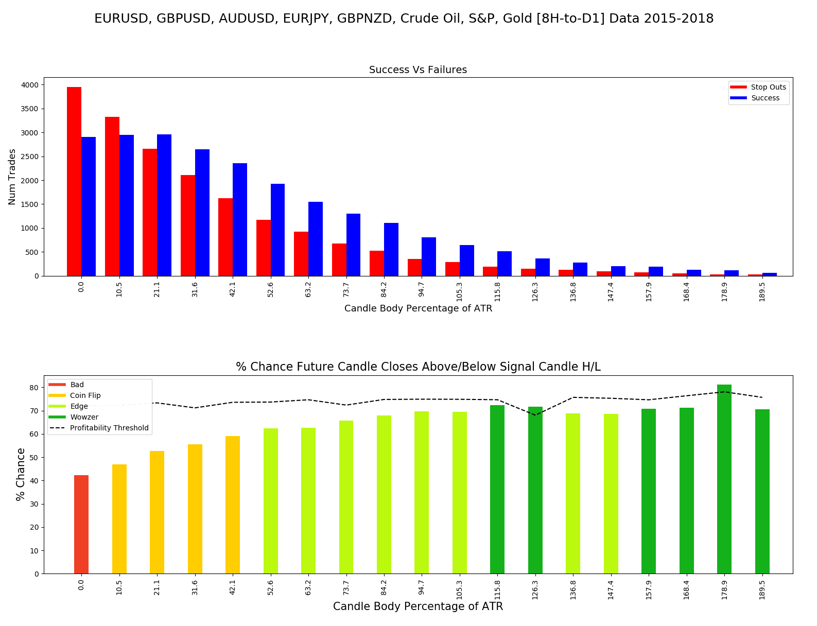
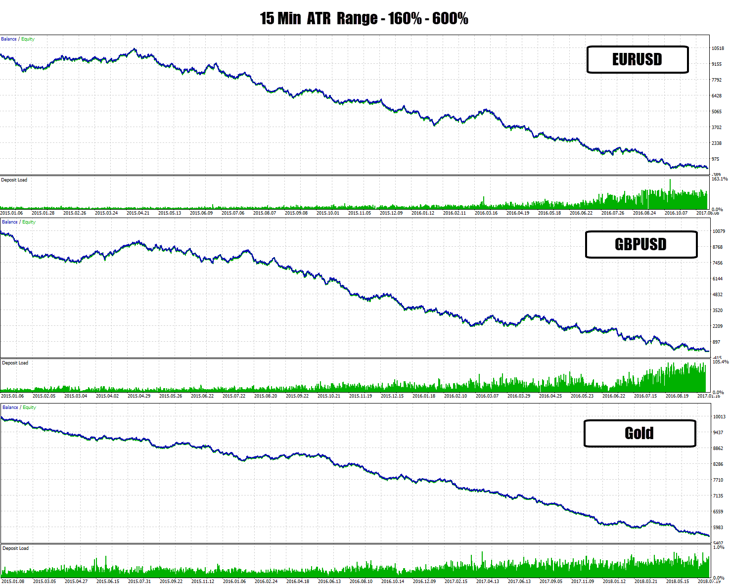
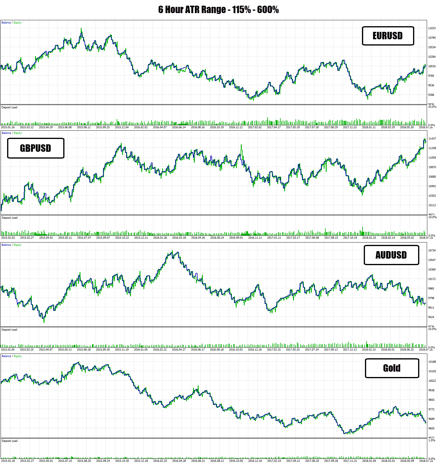
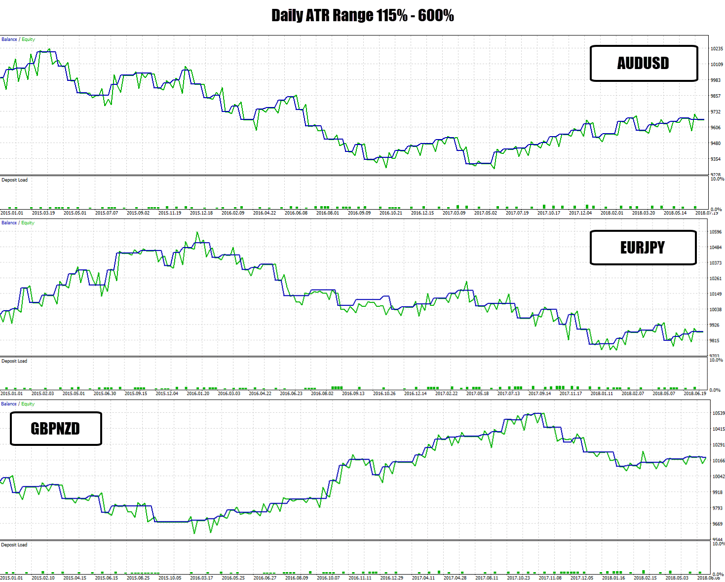
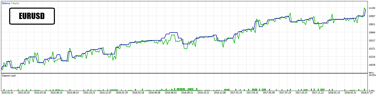
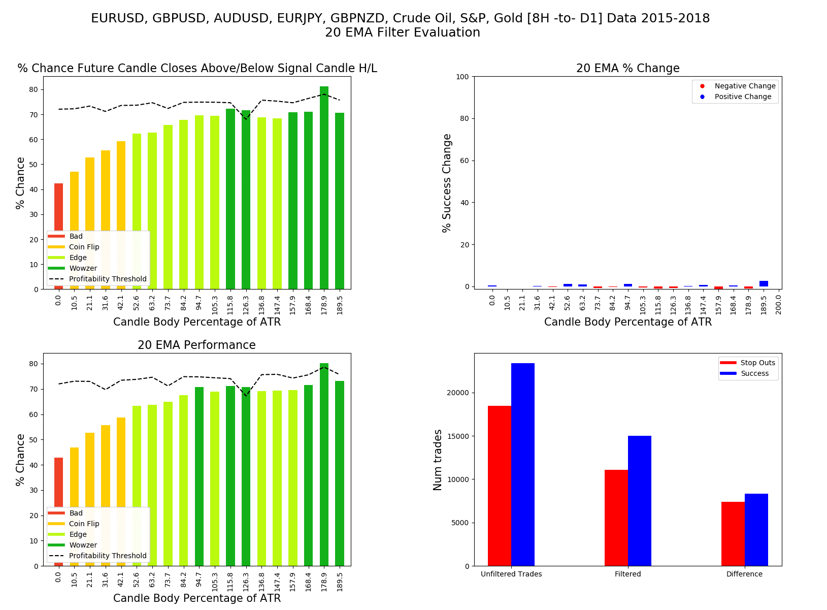
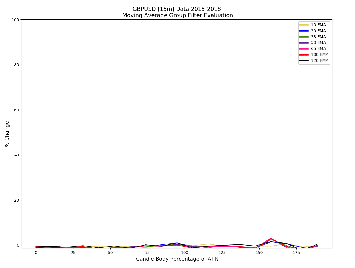
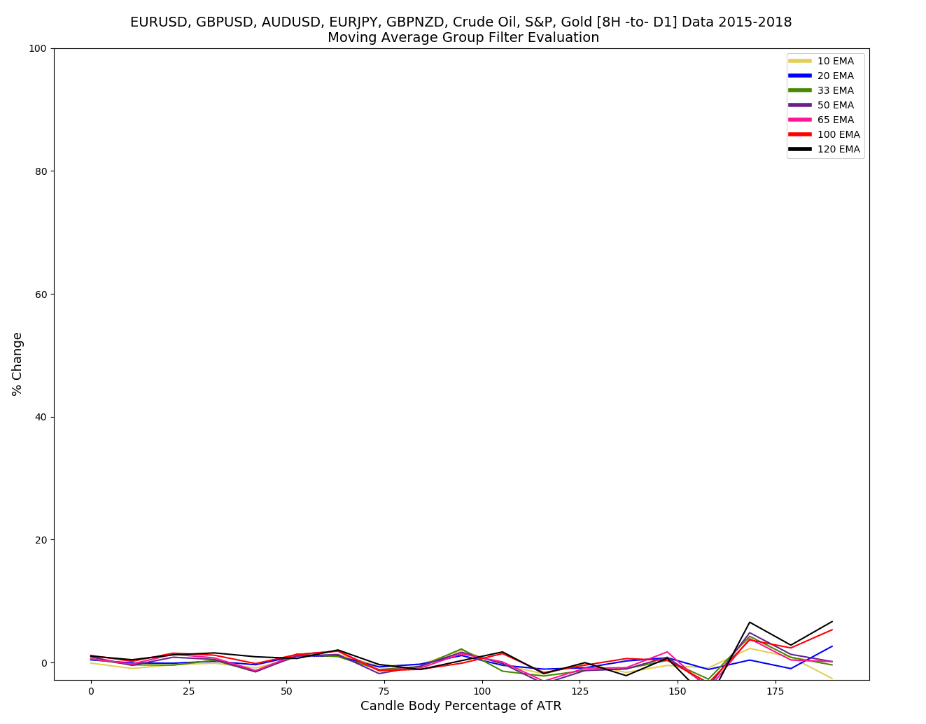
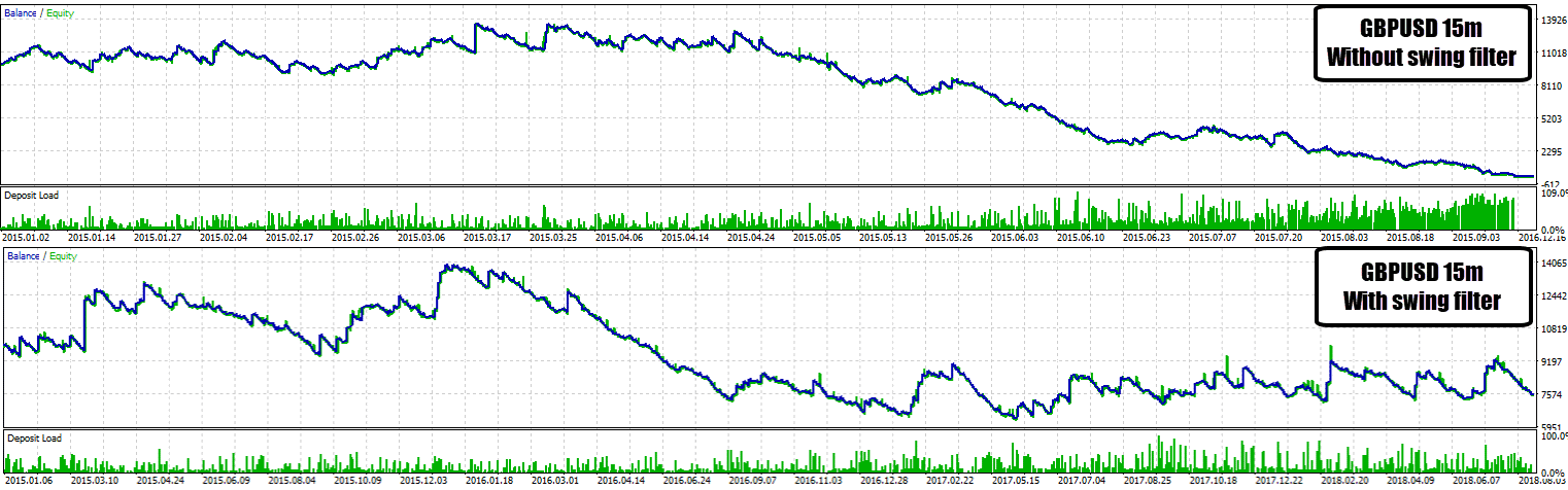
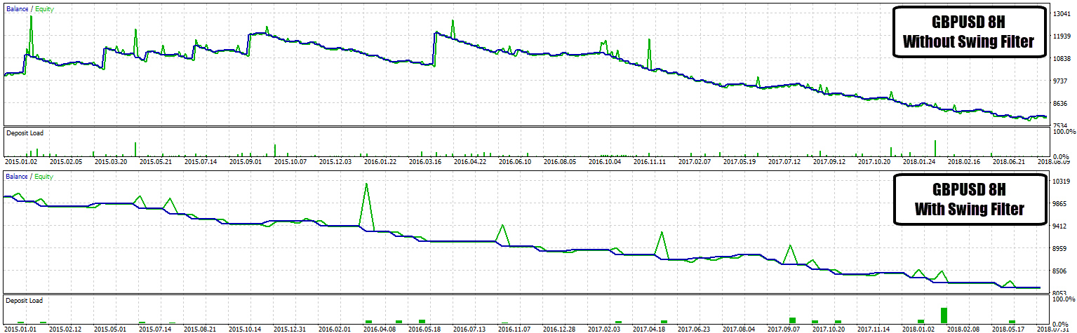
 Now that we have established a ‘baseline’ for this experiment, we can try adding filters to see if they improve performance.
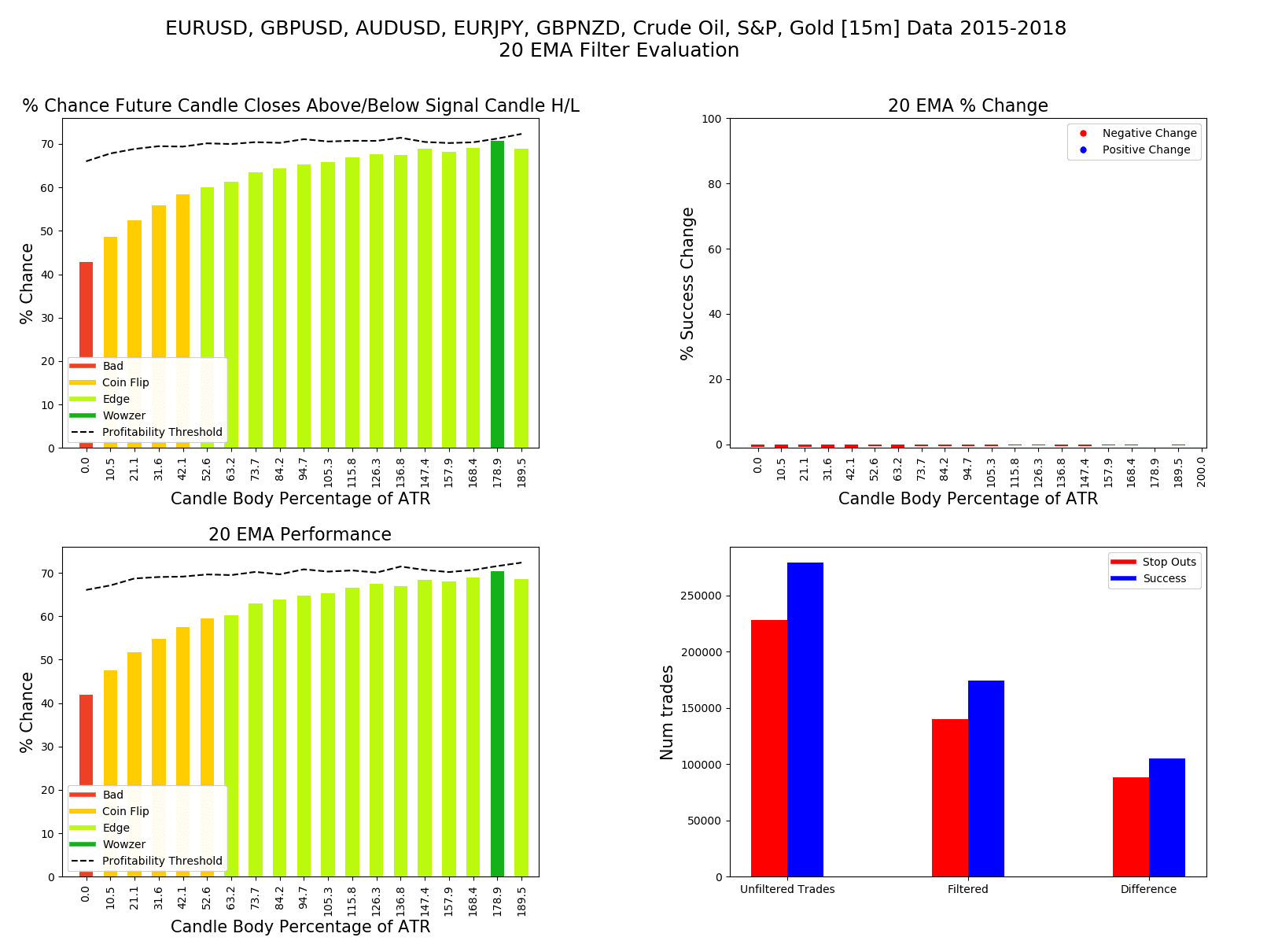
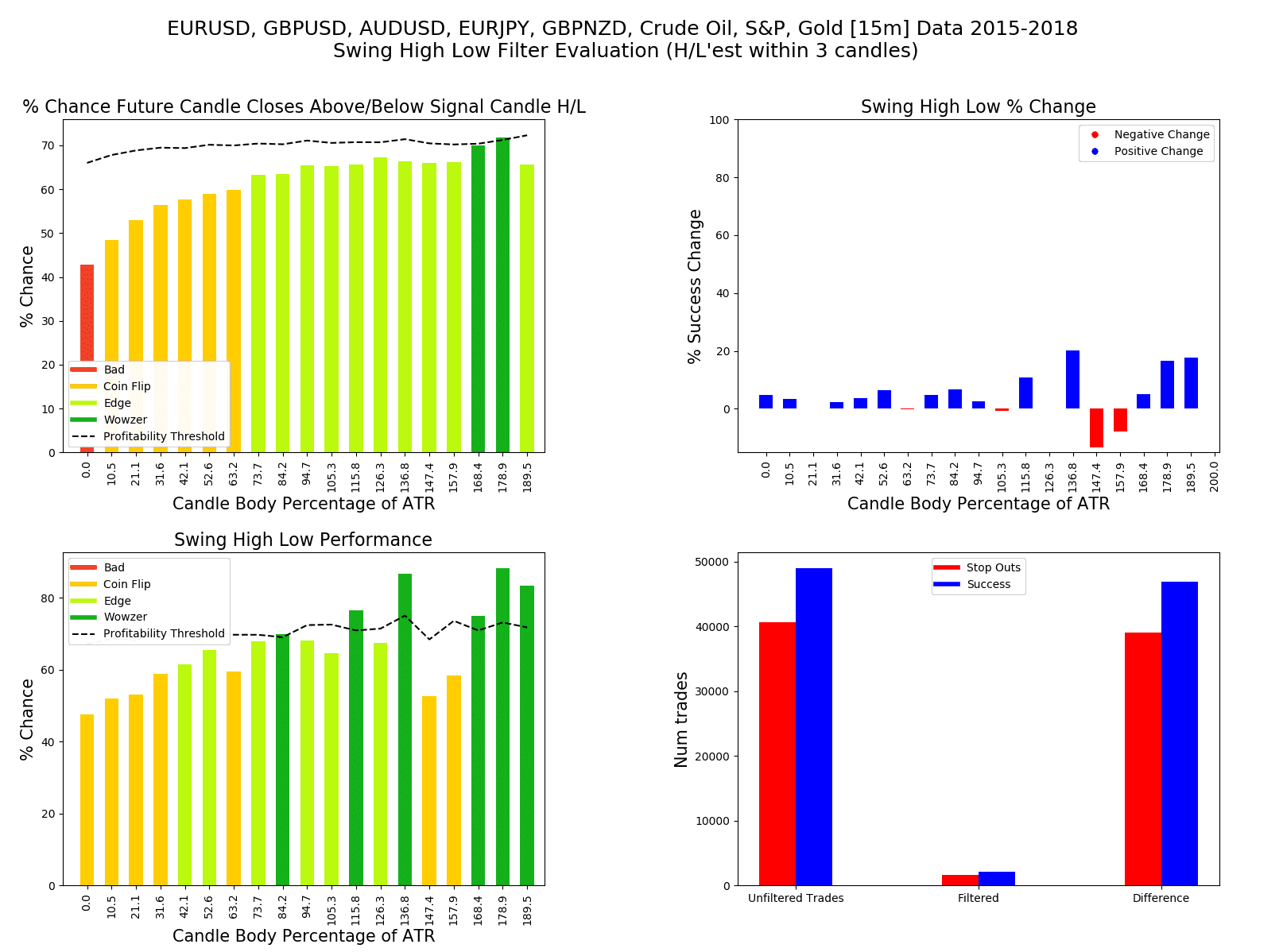
 This Forex candlestick pattern strategy is probably one of the most simple candlestick strategies you could think of, so my expectations were not high.